Eddy
A classroom platform that pairs elementary students across different schools to close equity gaps in access to technology and enrichment.
01
The Challenge
The Sustainable Development Goals (SDGs) are a collection of 17 interconnected global goals adopted by the United Nations in 2015 as a universal call to action to end poverty, protect the planet, and ensure peace and prosperity for all by 2030.
This assignment was to design a solution surrounding an SDG and we chose Quality Education.
02
Discovery & Insights
Personal Reflections
Comparing our elementary school experiences (NJ, Brooklyn, Brookline, Acton) showed stark gaps in STEM access, funding, and device timelines, even within the same country.
Competetive Analysis
ClassDojo, Discovery Education, and Class.com focused on family communication or admin-facing content yet none enabled peer-to-peer connection across schools of different resource levels. This became our core differentiator.
Classroom Technology Constraints
Only ~50% of U.S. districts have 1:1 device programs, so we designed for both take-home and shared-device (lab/projector) use from the start.
03
Design Process
All of this pointed to one guiding question: How might we create equitable learning opportunities for elementary school students across different income levels in Boston by creating technology that encourages personalized learning?
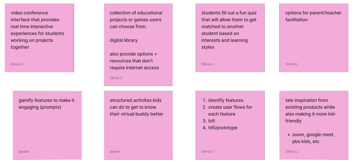
Phase 1: User Interviews & Market Research
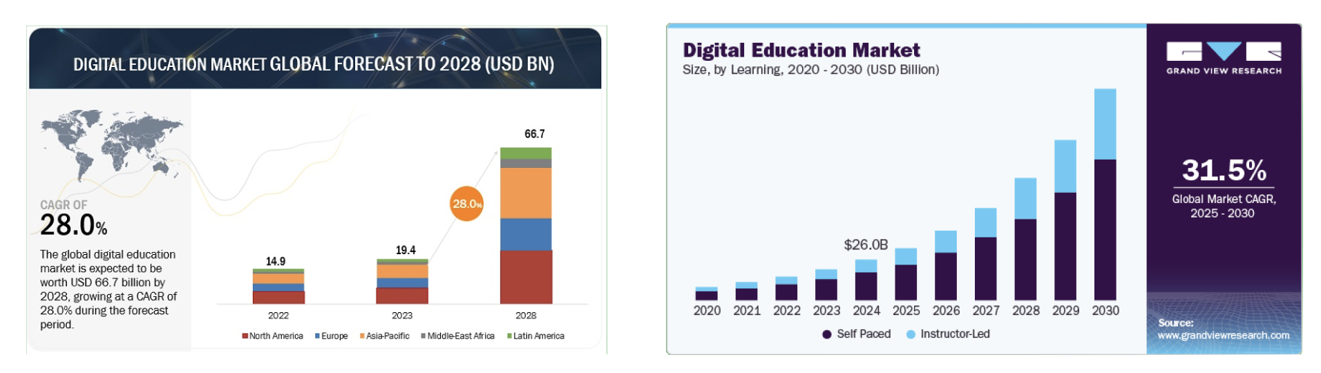
We interviewed an elementary school teacher and industry contacts about safety and classroom fit, and compared our own four grade-school experiences (NJ, Brooklyn, Brookline, Acton) alongside a peer who attended an underfunded Minneapolis school. Competitive analysis of ClassDojo, Discovery Education, and Class.com showed none enabled peer-to-peer connection across schools of different resource levels. Market research reinforced the opportunity: the digital education market is projected to grow at a 28% CAGR to $66.7B by 2028.
Phase 2: Mood Board & Branding
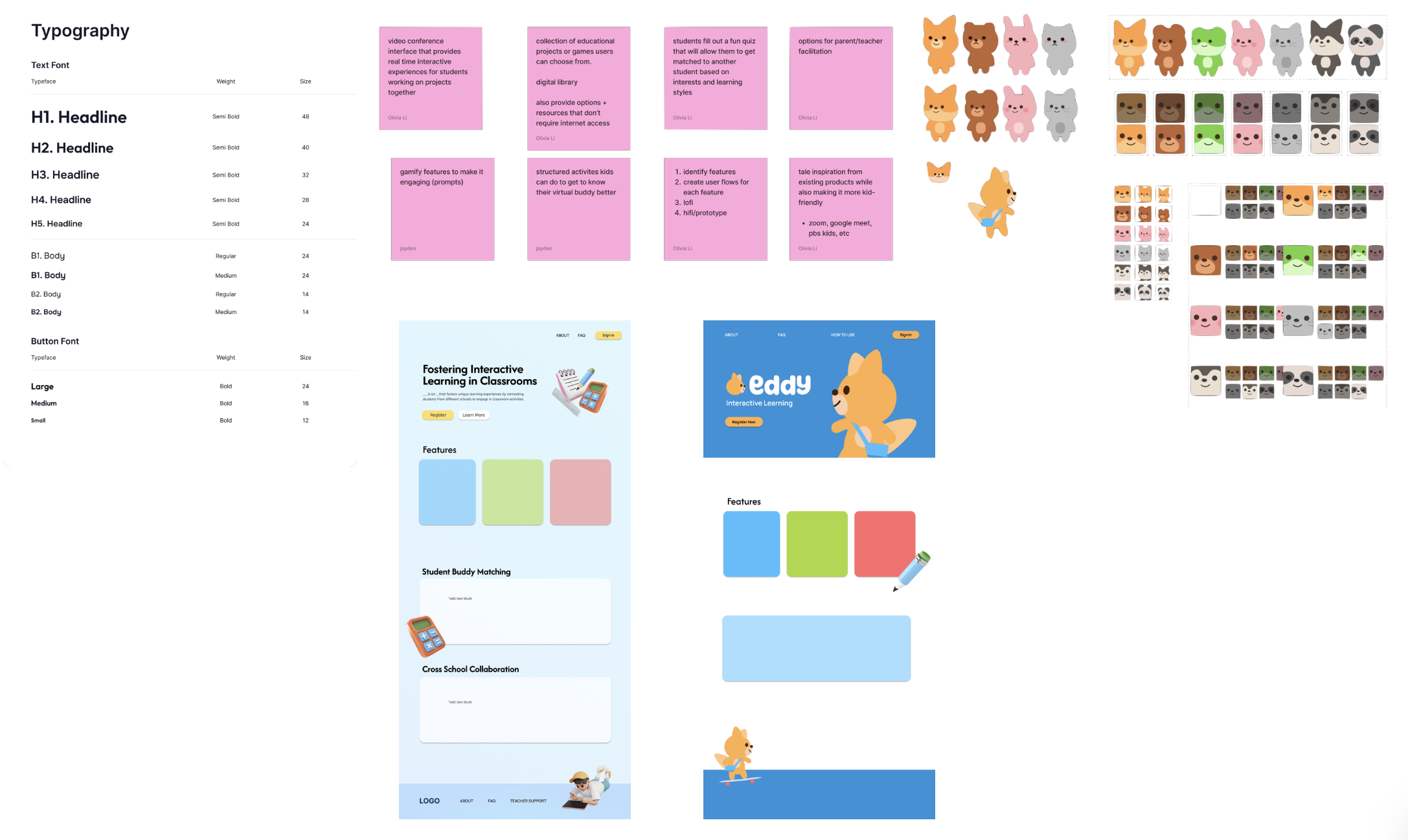
We named the product Eddy, combining 'education' with a mascot we could personify, and tested a fox, bear, frog, rabbit, cat, husky, and panda before landing on the fox. From there we built a full type system, button styles, and a playful, saturated color palette meant to feel lively and inviting for young minds rather than corporate.
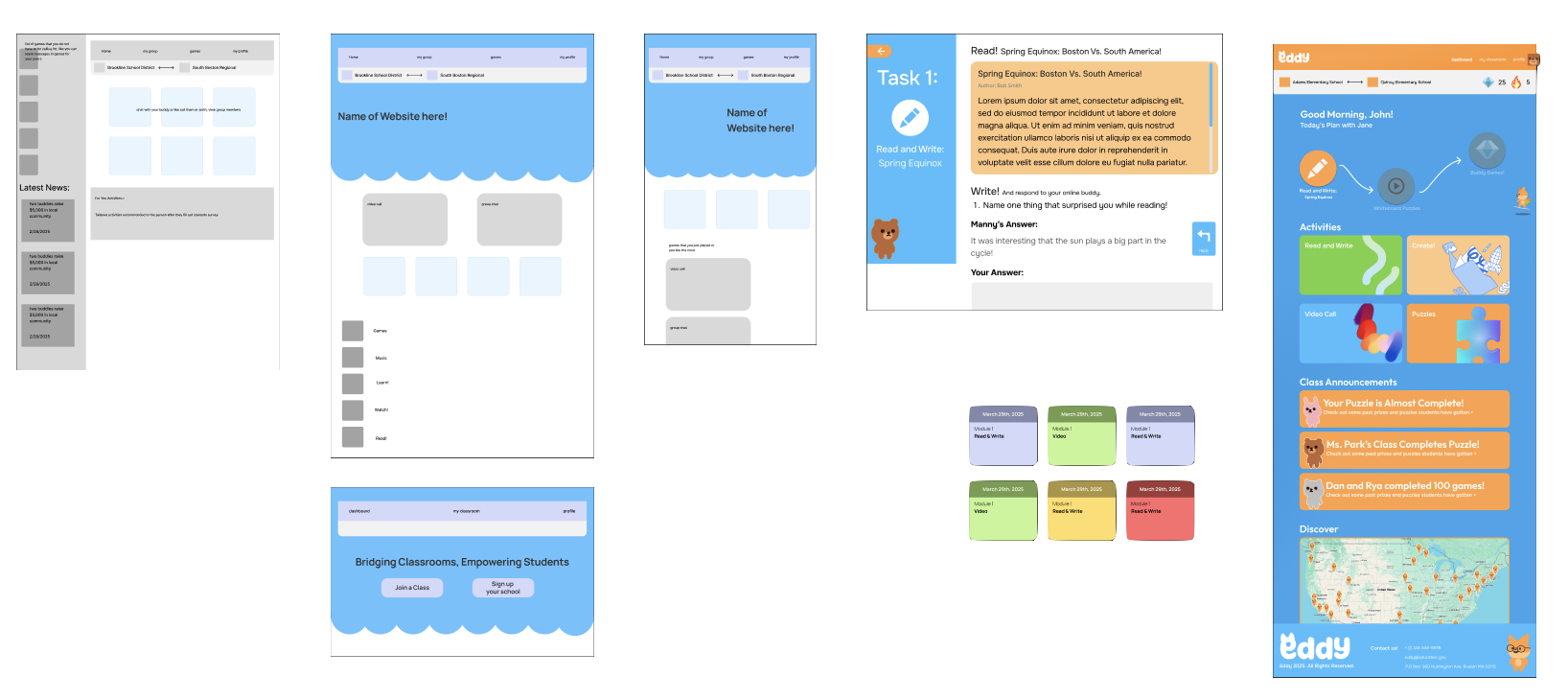
Phase 3: Lo-fis
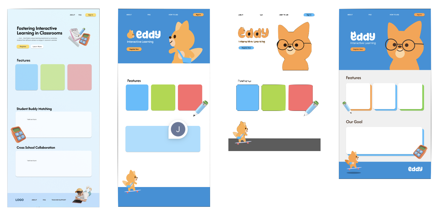
Early low-fidelity wireframes explored sidebar navigation for easy movement between activities, and tested how gamification (points, levels, a class roadmap) could sit alongside the buddy-pairing flow without overwhelming the screen. These layouts carried directly into the five core features we ultimately built.
04
The Solution
Interactive Prototype
The buddy-pairing flow, from interest survey to matched classroom activity.
05
Reflections
Inclusivity and integration aren't things you can solve with a single feature. The buddy system is a partial answer to a much bigger problem.
We went through a lot of ideas before landing on the buddy system as the core mechanic. Looking ahead, we'd want to expand beyond a single city, add features for parent involvement, give students a path to eventually meet their buddies in person, run actual user testing with elementary school students instead of relying on our own past experience, and integrate self-paced learning modules to match where the broader market is heading.